JPO decision highlights (Similarity) [from January to June of 2025]
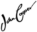
1. A case where “JOHN COOPER WORKS” and the cited trademarks were found dissimilar
| Appeal No. |
Present Trademark |
Cited Trademark |
| Appeal 2024-650086 |
 |

Reg. No. 1796381 (Class 18) and No. 2613159 (Class 25) |
Summary of Decision:
The JPO Board of Appeal held that the present mark, composed of both a device element and the words “JOHN COOPER WORKS,” should be considered as a unified whole. The words “JOHN” and “COOPER” could not be independently extracted to establish similarity with the cited marks “COOPER.” The Board found that the overall impression of the applied-for mark differed from the cited registrations, and thus the examiner’s finding of similarity under Article 4(1)(xi) of the Trademark Act was incorrect. The refusal was therefore overturned, and the application allowed for registration. |
Comment
- The Board emphasized that it is inappropriate to isolate part of a composite mark (“JOHN COOPER”) when the mark as a whole conveys a different impression.
- Even though “COOPER” was included, the addition of “JOHN” and “WORKS,” along with the distinctive device, created sufficient distinctiveness.
- This decision illustrates the principle that partial extraction of elements must be carefully justified and will not be allowed if the mark as a whole has a clear unified impression.
2. A case where “PAX (stylized with squares)” and “PAX (stylized with intersecting ovals)” were found dissimilar
| Appeal No. |
Present Trademark |
Cited Trademark |
| Appeal 2024-18719 |
 |
 |
Summary of Decision:
The JPO Board of Appeal overturned the refusal under Article 4(1)(xi) of the Trademark Act. Although both marks include the term “PAX,” the overall impressions differ significantly due to differences in color scheme, graphic design, and stylization. Neither mark conveys a specific concept, and while the pronunciation “PAX” or “P-A-X” is common, this similarity was not sufficient to outweigh the clear visual distinctions. The Board held that the marks are dissimilar and there is no likelihood of confusion as to the source of services. |
Comment
- The decision emphasizes that when evaluating similarity, overall impression—including design, color, and layout—can outweigh phonetic similarity.
- Even where the same letters are present, stylization and graphic elements may render marks dissimilar in the eyes of consumers.
- The case illustrates that Article 4(1)(xi) requires more than shared pronunciation; distinct visual features can prevent confusion in practice.


